The Importance Of “Attention To Detail” in Business.
The details are not the details. They make the design — Charles Eames
To provide a great user experience, a designer’s focus is on attention to details of a product. He/she examines each and every element, if it is needed, then try to transform, optimize the same.
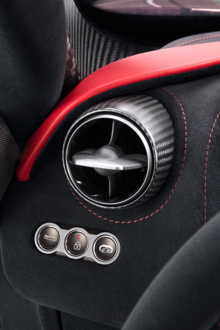
Priority is given to the places or points where user interaction happens. Those points of customer touch points can be Sizeable interaction moments or smaller/momentary interactions. Some brands may focus only on larger or substantial touch points and leave out smaller touch points. Great Brands focus on even smaller interaction and detail it out to provide a wonderful experience to the user.
Great Brands continuously seek out opportunities to express their brand. They see even those minor customer touch points as an opportunity to provide the best experience. Great brands believe that finest detailing in those minor touch points communicate a valuable message to the consumer and helps to build an emotional, loyal bond.
Attention to detail — the focus is just not on products alone — the entire value chain wherever customers interact — External Packaging while in the shelf as well as in the home, Customer care, Showroom, Store layout, Furniture, lighting, coupons, marketing advertisements — Every step, aspect of customer touch point.
The difference between something good and something great is attention to detail — Charles Swindoll
Below is an image of Door Handle of Ford All-New Fiesta(Image on the left) and VW Polo (Image on the right) — VW polo’s door handle is sturdy and well-built. Even the thickness and width are comfortable to hold. There might be reasons for Ford’s handle dimensions — not getting into those details. The problem with ford’s handle is — Gap between the two surfaces as marked — When we hold the handle tighter — those two surfaces move towards each other(Attaching a video too) and part of our finger’s skin gets stuck for a few million seconds — We can feel. In Polo, we do not feel any pinching effect. (All new Fiesta(2012) priced 11 lakhs INR and VW Polo(2010) priced 6 lakhs)

Look at the bottle holder detailed part in Ford — It is not strong as in Polo. This is another main user interaction point.
Below is the top cover Ford’s Instrumentation Cluster.
In VW Polo, this part is moulded as part of the dashboard — it is stronger, In Ford, It is a separate part and attached as a cantilever support.

See the Hinge detail of Wiper water Refiller lid — Ford (Image on the left) and Polo (Image on the right). Ford’s lid is very flimsy — it feels like it’d come out any time.

We may not refill water every day — Even though the frequency of interaction is less, VW Polo has made sure that we do not feel the flimsiness. It is stronger than Ford. See the lid of Coolant lid.
During rain, when we lower side window and raise, those rubbers are designed to wipe the water from the window, so that we can see the road, when taking 90 degree turns. Every touch point Polo has detailed in such a way to provide a better experience — dashboard glove box door to steering wheel sturdiness to 3 stage opening of doors to seat belts.
Let’s look at the mac products
Apple has a remarkable user experience in their products. The software has many touch points to surprise a user. Let us see some of the external minor touch points in an Apple product.
MagSafe power connector — Made it easy to plug in/plug out of the power connector to support our hand’s natural angular movement, rather than forcing us to move the connector perpendicular. Another important benefit — If someone unknowing trips of the wire, the laptop will not fall off. Strong enough to hold on, but weak enough to avoid taking the MacBook with them.

MagSafe Adapter
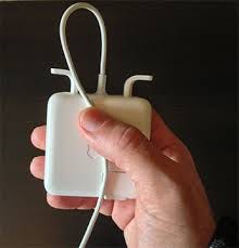
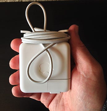
External Battery Level Indicator — without opening the laptop, we can figure out how much battery power left

CD — Just insert the CD, it goes inside. Press a button — CD ejects out. No sliding tray to hold the cd.

The seamless surface around the screen — No Step around the screen. Camera merged with the form — Visible only when needed.

Only a few points are covered here.
Starbucks — Great coffee taste, Packaging, Interiors, Wooden countertops, Lighting, Furniture, Entrance, Graphics, Clean environment, TOILETS and above all Customer service. Starbucks has worked on each and very detail of consumer’s touch points.
The interior design varies from store to store -part of heritage design and a blend of local culture wherever possible — It is a mix of organic products and manufactured components.
I’ve collected some images about Starbucks store at Orlando from the below link
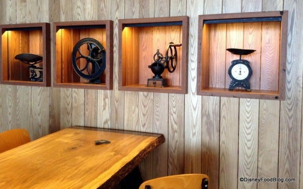
Display of Antique Products — Organic-inspired elements blended with sleek, modern touch, Lighting, Color of antiques, the contrast wooden border mimicking coffee tone, Wall — smooth surface finish, the natural lighter tone of wood nicely finished, Handcrafted appearance for table edges to communicate quality to a user, Finishes on the table

Green roof filled with hundreds of lemongrass plants

Large Community wooden tables, Stained concrete floor, metal stools — club chairs — evoke heritage feeling


Handwritten format — Board with a wooden border — Heritage concept

Moss art installation to bring nature inside the coffeehouse
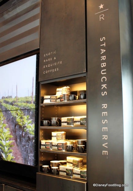
A mix of modern elements — coffee tones — Lighting too in coffee tones — In one of the walls, we could see a video showing history and source of coffee procurement


Murals — They tell a kind of story — Maybe a story of a coffee bean — storytelling hooks a user and it is easier to position our brand strongly in mind by story association. Handcrafted visual story are valued more and makes the task much easier.
ZAPPOS — A lot has been written about this brand. Great customer care. Often I’ve heard stories about how representatives have spent hours talking to customers. If a customer wants a product and it is out of stock, the representative would search the competitor’s website and direct the customer there.
NEST, when first launched, they shipped three types of screws. Soon, the team realized that the users were not having a great experience. The team started reworking on the design. Investors got frustrated “Why are you spending so much time on a little screw? Get out there and sell more”. The team’s response “We will sell more if we get this right”.
Great Brands may talk about bigger benefits in media, but they would have already taken care of smaller things. Every minor user interaction counts and it is an occasion to enhance the brand’s value.
References: Wired to Care by Dev Patnaik, Designing for Growth — Time Ogilvie, Thinking Fast and Slow by Daniel Kahneman, Unconscious Branding by Douglas Van Praet, What Great Brands Do by Denise Lee, Marketing Aesthetics by Bernd Schmitt, Meaningful by Bernadette Jiwa